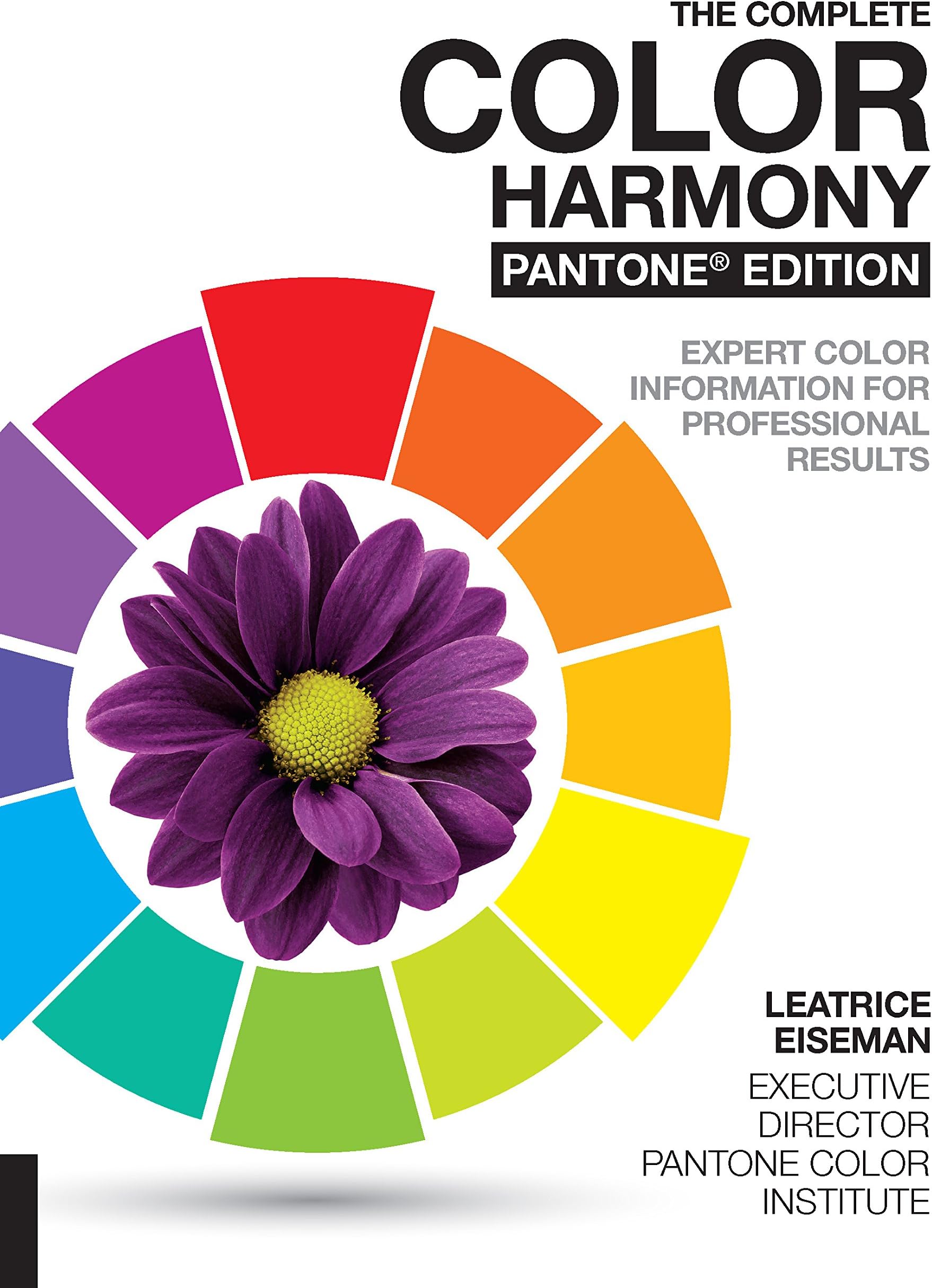
The Complete Color Harmony, Pantone Edition: Expert Color Information for Professional Results
Product ID: 48774020
🎨1000+ Pantone colors curated
📚Fully revised expert text by Eiseman
🧠New psychology of color insights
Buy anything from 5,000+ international stores. One checkout price. No surprise fees. Join 2M+ shoppers on Desertcart.
Desertcart purchases this item on your behalf and handles shipping, customs, and support to British Virgin Islands.
🎨 Master color like a pro — never face a blank canvas again!
The Complete Color Harmony, Pantone Edition is the definitive color reference for designers and artists, featuring over 1000 Pantone colors, expert commentary by Leatrice Eiseman, and new sections on color psychology and trends. This fully updated guide transforms color theory into actionable palettes, empowering creative professionals to craft visually stunning, mood-driven designs with confidence.


| Best Sellers Rank | #14,395 in Books ( See Top 100 in Books ) #8 in Decorative Arts #13 in Graphic Design Color Use |
| Customer Reviews | 4.6 out of 5 stars 1,435 Reviews |
R**R
My New Inspiration!
I bought this book to help me try new color patterns in my watercolor art; my go-tos were getting a little overused. It’s been really useful and I enjoy browsing it for inspiration. The book itself has a nice matte paperback cover and the spine has held up well even with frequent use. The beginning of the book offers specific information on individual hues. After that, the majority of the book is dedicated to hundreds of color palettes categorized by "mood" or theme—like Earthy or Urban. As a watercolor artist, I find myself using this quite a bit. It’s especially helpful for finding unique color combinations for flower bouquets or landscapes that I might not have naturally thought to use. It takes the guesswork out of color theory and makes the "blank page" stage much less intimidating. Overall, if you are a designer, artist, or just someone looking to refresh a color scheme, this is an excellent reference guide. Highly recommend!
K**Y
IT SPARKS JOY!
Lovely book with beautiful color schemes and examples. Page after page of beautiful color combinations. Any time I feel stuck on what colors to use in my next watercolor...I just pick up this book!
J**Y
Better &More Useful than the Originals - and That's Saying Something
I have owned and loved several different editions of the Color Harmony books over the years, including one in Japanese. The first one came out in English thirty years ago, in 1987. The different volumes used a set palette of colors and then showed them in combinations of two to four colors. Most of the volumes have color cards in the back that make up for the rather small swatches in the color palette pictures themselves. The first two volumes of Color Harmony look at color in different ways. The first volume divides the combinations into categories similar to the ones we are used to considering. The second volume which came out ten years later looks at color schemes according to mood. Within each mood, they divide the combinations into sections by color scheme. This volume is unique because it actually provides you with neutral suggestions for each mood, although its definition of neutral is very narrow. I was excited to see that this new edition with the cooperation of Pantone was coming out. The book opens with a text section which is excellent. There are chapters on different aspects of color as well as chapters on the psychology of color, featuring a baker's dozen different colors. While I don't always agree with their interpretations, it's interesting to read. As one would expect from a Pantone book, the color pictures are ravishing and the text is well written. The next sections, and the bulk of the book, cover color and mood. I really liked that it expanded the areas covered in these chapters to include subjects like fashion and interior design. Older versions focused too much on the needs of graphic artists. This also makes it more useful for us as needlepointers. Just looking at one page at random, from Provocative, I can see hot pink, in several Pantone colors, used as main, secondary, and accent colors in combinations that include everything from bright orange to rich teals. It gives me so many ideas for needlepoint! (In a future post will look at exactly how to translate these combinations to needlepoint.) The palettes in the book reflect a wider audience as well with many of the palettes containing color schemes too subtle to work in packaging and in other graphic design applications. But they could make great schemes for rooms or clothing or fiber art! Some of my favorite palettes are these, many in the section Delicate. While I probably wouldn't use them as is; these pale almost white schemes have given me so many ideas for backgrounds. The color palettes, which are keyed to colors in the Pantone system, are shown for each of the color moods in the second half of the book. They are shown in rings with the colors in proportion to dominant, secondary, and accent. No other numbering system is shown, you will need another reference for that. While I like the proportional display, I'm not sure that I like the rings. The white space in the center is distracting. On the plus side, it does allow presentation of a dozen palettes per page without them seeming crowded. This is great compared to the 2q4 small combination shown per page in the original books. The later text sections of the book look at psychological aspects of color with sections on color personality, the affect of color on our lives, and color forecasting, among other topics. These sections also have many intriguing ideas. The Color Harmony books have a wonderful ability to help you look at color in a new way. They have probably been more influential in how I think about and use color than any other books except the ones specifically about color in needlework. Because of them I have become braver in how I think about color and in how I combine them. However the earlier versions skewed a bit too much to graphic artists for me to adapt many of the schemes. Because Pantone as a company works with a much broader audience, these palettes are ones that I will cheerfully and quickly adopt. This is a worthy addition to the series.
J**M
Book is great, but not in good condition
The book is exactly what I was looking for. Lots and lots of color palettes for every theme and mood, with the Pantone color #s. Comprehensive and just perfect for my purposes. BUT - it came in the usual Amazon bubble wrap envelope infused with their "signature scent" that gives me a headache. The book was not wrapped in plastic (was it new? hard to tell), the corners are banged up, but the biggest problem is how badly it smells. I'm not sure how to get rid of the stench or if I ever will. Disappointing!
G**N
The Complete Color Harmony, Pantone Edition
Pantone is a new color-system started in the 1970s that gives each unique color a number so if you have that library on your computer simply keying-in that number will produce that color. This is a great way to find and use the right color for anything. If you have more than just a general idea, for instance the Mood you might want to convey, or the more conventional colors for business, Pantone has it covered with suggestions and examples. Or if you just want to hunt for the right color for your subject, once you find it you can instantly HAVE it with that number. This is a lovely book packed with categories and sections for specific coloration, and just thousands of color combinations that might work for you, perhaps even like nothing you've ever imagined... It's a book that's sure to change your thinking about color. Pantone is used by all sorts of professionals in printing, graphics and advertising, as well as the most foreword artists. Particularly if the artwork is large and likely to be the collective work of several businesses, everybody has a standard for color so the illustration will always look the way it was designed.
D**E
Nice book...I'll keep it forever
I love this well put together book. It shows color combinations and places them with moods and feelings. I use it in my watercolor paintings and find it especially useful with my crochet patterns and blanket ideas. I love this book!
A**R
Love it!
I'm to some degree a lazy person so trying numerous combination of mixing colors was always a drag. This book has hundred of them, grouped in more than 30 mood themes. The text is informative, not overwhelming, short. Definitely, color is a star in this book. Example pictures are chosen very well, too. I love it! PS. Please, read carefully page 55 - it explains how to use the book if you want less or more colors added to your projects.
W**E
Complete
Comprehensive, complete and a great colour guide book for anyone. Can be used for painting, colouring, knitting etc. Teaches you which colours pairs well with which. Overtime you'll remember it naturally.
V**L
Wow
Un gran libro, muy completo, dinámico y con varios propuestas de color
S**Y
Perfect and delightful
Thanks!!!
S**U
Tres bien fait ! bon outil de travail !
Tres bien fait ! Beaucoup de planche avec des roulettes de couleur, bon pour les artistes de peinture, les professionnels de désigne, peintre à l'aiguille qui ont besoin de couleur en dégradé. C'est un bon outil de travail !!
A**A
I like it.
Gives quite a nice color combinations to follow if ypu lok for some inspirations.
Z**I
حبيته لكن الطباعة غير الالوان
للاسف بعض الصفحات الطباعة الالوان باهته بسبب سوء جودة الطباعة او نوعيه الورق بس الكتاب مررة مفيد للي يبحب التنسيق ومعرفه الالوان
Trustpilot
3 weeks ago
1 week ago